Saturday 29 August 2015

Delphinium Blues ...

Good afternoon!  It has been a lovely start to my weekend as I was lucky enough to be invited to be a Guest designer at "Less is More" and my card went live this morning ... I've already received some lovely comments on my card, comments and kind wishes that I cherish.

This post is all about trying a new technique - an attempt to create something different with an embossing folder.  In the deep, dark recesses of my brain I read about or watched someone emboss a piece of coloured card and then brayer some white paint over the top - I liked the idea so thought I would give it a go with a twist (if I ever remember where I saw it I'll let you know!).  This is the end result:


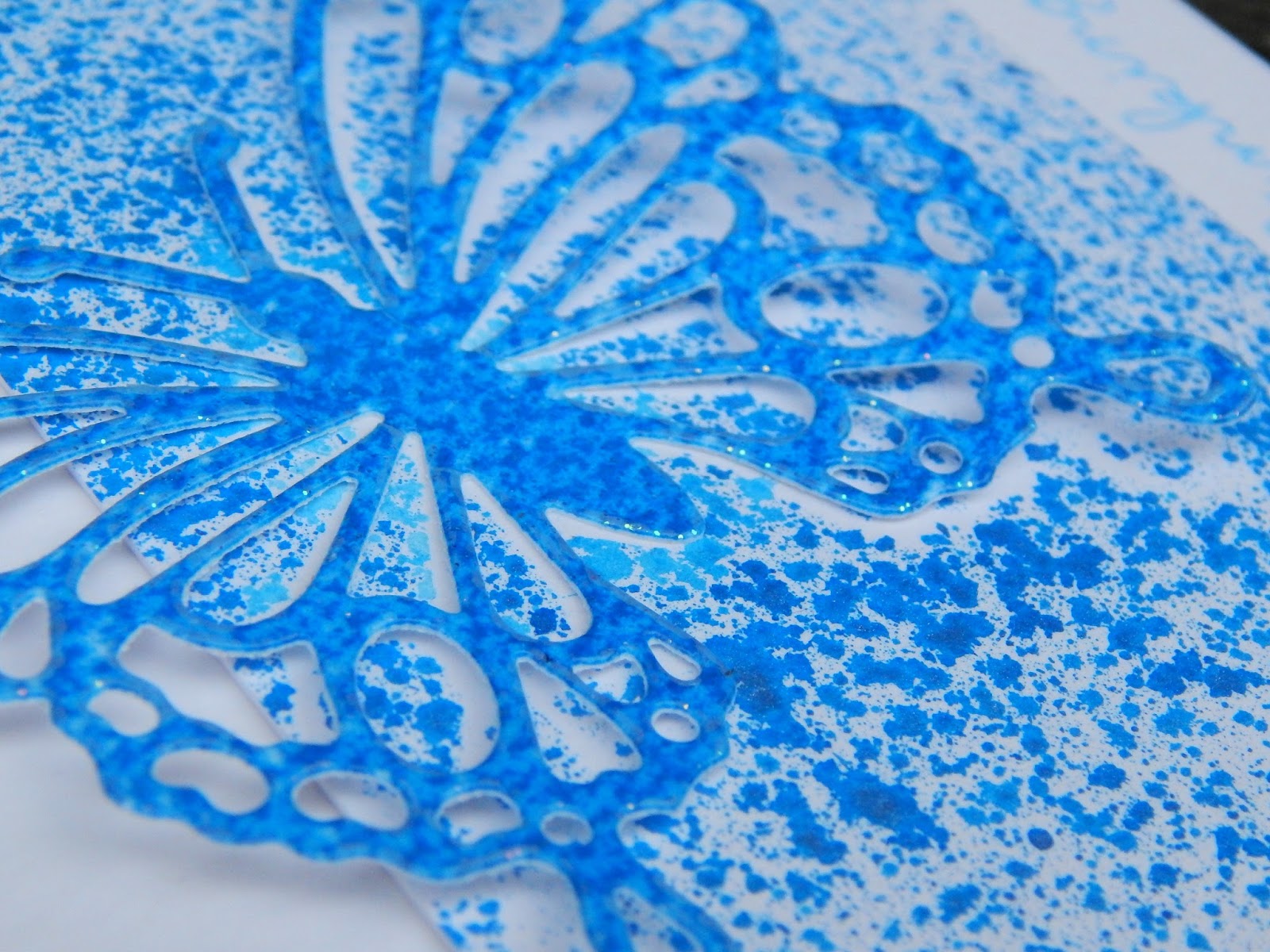
The embossing is not that clear to see in the photograph but it has provided a great deal of texture to the flowers.  I began by embossing a piece of water colour card (this is the twist as I used white card and coloured paint rather than coloured card and white paint!) with a Sheena Douglass perfect partners embossing folder.  I then lightly brayed some ultramarine acrylic paint over the image - trying to keep the paint on the raised ridges.  This is how the panel looked:


When the paint was dry I fussy cut the blooms before colouring with a Zig Clean color marker and some water - it took ages!  I might try the technique with a different folder and no fussy cutting!

I used:

Sheena Douglass Perfect Partners Embossing Folder
Zig Clean Color Real Brush Marker - Blue
Daler Rowney System 3 Acrylic Paint - Ultramarine
Clearly Besotted Pretty Petals Plus Stamp set

I am entering the following challenge:

Addicted to CAS Challenge 71


Enjoy!

LIM Guest Designer ...

I am excited and honoured to have been asked by Chrissie - "Less is More" - to be a Guest Designer this weekend for the last challenge of the month.  As always I jumped in with both feet without knowing details about the theme/topic/recipe of the challenge and said "Yes, of course I would love to be a Guest Designer".  Imagine my surprise (delight) when Chrissie told me that the recipe is Spray Mists - what is one of the items my craft stash is lacking?  Yes, you've guessed - Spray Mists!!

So the process began by creating a spray (or two!).  I took some Salty Ocean Distress ink added some perfect pearls and some water - it took quite a few attempts before I was 'happy' with the intensity of the colour.  It then took quite a lot of card to work out how to get the spray effect that looked right - enough to look like spray but not too much to cove the card!  This is it:


I used the spray to colour a panel of card, using a die cut butterfly as a stencil.  I trimmed the panel and sprayed the die cut and then heat embossed it with clear embossing powder.  I adhered the panel to a square card before adding the butterfly (gluing only the body to add dimension) and finished by stamping a sentiment with the same Salty Ocean Distress Ink.

Ingredients include:
Perfect Pearls
Salty Ocean Distress Ink
Simon Says Stamp Handwritten Borders
Sweet Dixie Butterfly Die
Crafter's Companion Water Colour Card.

Enjoy!

Thursday 27 August 2015

Happy 40th ...

A quick post this evening to share this card:


It's my nephew's 40th birthday next month so I needed to create a suitable card.  To say I was struggling to come up with an idea is an understatement - I went on the hunt for inspiration!  I watched a video with Jennifer McGuire creating faux metal card with perfect pearls - I liked the effect so thought I would have a go.  

I took a small panel of card and blended three distress inks across the whole of the panel and then brushed over it with perfect pearls.  Finally I "polished" the panel then die cut the number 40 before embossing the panel using a number embossing folder.  I cut 4 or 5 additional number 40s before stacking and gluing them together.  Added a sentiment and that was that!!

I used:
Distress Inks - Peacock Feathers, Salty Ocean and Chipped Sapphire
Perfect Pearls - Perfect Pearls
Numbers Embossing Folder - Cuttlebug
Clearly Besotted Geometric Style Stamp set for the sentiment.

I am entering the following challenges:

Seize the Birthday Challenge
Simon Says Stamp Blog Wednesday Challenge "Anything Goes"

Enjoy!

Wednesday 26 August 2015

Gelli Gerbera ...

To say that it has been raining today would be an understatement ... so no gardening and no garage sorting!  It is such a shame I had no option but to craft all day!  I've started lots of different things but only managed to finish one card.  I really must learn to concentrate on one thing at a time but today I've flitted between three different projects - some I may share later either on my blog or with the recycling bin!

Anyway less chat on to my card:


This card started with a piece of a gelli print left behind from another card which I stamped with the gerbera stamp before die cutting with the new matching die (thanks to Bev at Uniko, I'm not a fan of fussy cutting!!).  I cut a small panel and spread some molding paste to add texture before sticking a few die cut bricks.  The thread is from some hessian.

I used:
Uniko Pure Florals: Gerbera
Golden Light Molding Paste
Crafters  Workshop Mini Rustic Paint Stencil
Marianne Design Brick wall die
Versafine Onyx Black Ink
Galaxy Gold Ink

I am entering the following challenges:

Uniko Challenge #24 Summer with the optional twist of using this photograph for inspiration


Addicted to Stamps #159 Clean and Simple

Enjoy!

Tuesday 25 August 2015

Merry and Bright ...

Hi again for my second post of the day!  this is the second card I made today and the first Christmas card I've made this year ... I might have to put some extra effort in if I am to have enough cards to send this Christmas.

Here's the card:


This card looks a lot brighter and merrier in real life!  I had problems with capturing a decent photograph ... it has been raining for most of the day and is quite dark and dreary!  I really need to find a way of taking decent photographs indoors and quick as the days are starting to draw in and we are on the downhill run to winter.

The design is inspired by this months sketch challenge at Happy Little Stampers:


I've used one of my favourite techniques - in laid die cuts - to create this card using my new Sheena Douglass stamp and matching die.  I've coloured the image with Zig Real Brush Clean Colour markers and highlighted the lights with a touch of Wink of Stella clear pen (not that you can see it in the photograph!!!)

I used:
Versafine Onyx Black Ink
Zig Clean Colour Markers
Sheena Douglass Perfect Partners, Festive Fancies stamp set and matching die.

Enjoy!

Back to butterflies ...

It is the last week of the school holidays - so it's back to work for me next week!  It is amazing how quickly the holiday weeks go by ... long before I've managed to do all the things I'd planned. I'm back from another long weekend in Lincolnshire - most of the time was sorting out bits and pieces for my parents.  Mum and I did spend a lovely day crafting on Sunday in the company of many like minded crafters at a Dabble Day organised by Jo Channon of Let's Create  (a brilliant craft shop in Tattershall).  We both thoroughly enjoyed ourselves and learnt a couple of new techniques - I just need to find time to try them again (before I forget!).

Moving on ... I've spent the day messing around with card, stamps, ink and dies.  I had hoped to sort the garden but as we seem to have reverted to classic summer weather - rain and more rain - I had no choice but to stay inside and craft!!  I could have cleaned the house and dusted ...

This is one of the cards I managed to create:


My starting point was the sketch for the challenge at "Less is More"


As you will see I turned the sketch on its head and cut a slice from the front of the card to reflect the sketch before multi stamping the butterflies on the inside.  I used the following:

Uniko English Country Garden - Butterflies
Simon Says Stamp - Handwritten Borders
Distress Inks - Festive Berries, Ripe Persimmon, Squeezed Lemonade, Mowed Lawn, Salty Ocean, Chipped Sapphire and Dusty Concord
Versafine Onyx Black

Enjoy!

Tuesday 18 August 2015

Mono-printing meets mixed media ..

Good afternoon!  Another day, another card ... quite different from my usual style of clean and simple.  Indecision meant that this card took me all morning to create ... was it worth it?  I leave that question for you to decide!

Straight to the card:


This card started with a mono print I created using my gelli plate some acrylic paint and a selection of stencils - this is the print before I cut it up!

The light was not kind to me when taking this photograph!
I used gold metallic paint on the top layer of the print.  After cleaning off my brayer on another sheet of card I used this to die cut the butterflies - I like the effect this has given to the butterflies as it has more texture than a piece of gold card would have.  I also die cut the butterflies in midnight blue card to create a shadow and hopefully make them stand out from the background. The print is stitched to a piece of midnight blue card that just peaks out on two edges - the stitching is just on two sides to echo the blue card edge. I added some texture paste through a stencil on the card base.  The sentiment is white embossed on midnight blue card.

The inspiration for this card was the current challenge at Mixed Media Card Challenge the theme is Butterflies with the optional element of gold:


I'm delighted to have received a Top Three place for another of my cards, this time it is from the team at Addicted to CAS - thank you so much.  This is the card:


Enjoy!

Saturday 15 August 2015

Congratulations ...

Wow, it's so long since I posted on my blog ... apologies to my regular followers.  I've been away visiting my parents in Lincolnshire and doing some jobs for them.  I've been back since Tuesday but my card making mojo has taken a holiday ... and I've been sidetracked refurbishing some furniture.  This morning I was determined to get back to my cards and enter a couple of challenges.

I watched a video recently with Jennifer McGuire colouring with bleach and remembered that it was a technique I used sometime ago with kraft card but had forgotten all about (I put it down to old age!).  So I thought I would have ago using distress inks ... this is the result:


I inked a piece of white card with spiced marmalade and festive berries distress inks.  Once the panel was dry I stamped the image with spiced marmalade and heat embossed with clear embossing powder.  I then coloured (or rather un-coloured!) the flowers with bleach - I adhered this panel flat to the card and then added two raised pieces of card to add some dimension, stamped the sentiment and that was it!

I'm going to enter the card into the following challenges:

"Less is More" the theme for this week's is "Congratulations"
CAS(E) this Sketch #136


I used:
Distress Inks - Spiced Marmalade, Festive Berries
Funstamps Clear Embossing Powder
Uniko Pure Florals: Chrysanthemum Stamp Set
Bleach

I'm always surprised when one of my cards wins a challenge but equally delighted to be chosen. This week I've had a card ShowCased at "Less is More" - thank you to the designers that chose my card and for all the wonderful comments that visitors have left for me.  This is the card:


Enjoy!

Monday 3 August 2015

Chrysanthemum delight ...

Do you ever have one of those days ... when everything you touch just doesn't work, that little job that should take minutes ends up taking ages, the idea you had doesn't work? Oh well, moving on ...

I started this card yesterday - it involved lots of heat embossing to mask off images and lots of ink blending and loads of time just being patient and waiting for ink to dry!!


I inked the panel with Picked Raspberry then heat embossed the first flower, then inked the panel with Festive Berries then stamped and embossed two more flowers. I then inked the panel with Dusty Concord then stamped and embossed more flowers and finally inked the panel with Stampin Up's Blackberry Bliss.  I ironed the panel to remove the embossing and then stamped the flowers details, masking off the flowers as I went.  The flower is from the Uniko Pure Florals: Chrysanthemum stamp set.

I am entering the following challenges:

"Less is More" - Week 235, Colour Challenge - Berry Shades
Happy Little Stampers


Enjoy!

This is the other card I created today, in fact it is the first card I created.  I'd been thinking about the design for sometime - I had trouble with the colouring, trouble with the stamping, the die cutting didn't want to work for me but in the end I was happy with the card.  Water colouring and inlaid dies are two of my favourite techniques ... and then disaster struck:


... and the moral of the story ... put completed cards somewhere safe and never leave black ink pads open on your desk!!

Sunday 2 August 2015

Berry Delight ...

Goodness me it is August already and end of week two of the summer holidays!

It is colour challenge week over at "Less is More" - Berry Shades.  This is my contribution to the challenge:


Simple water colour design.  I heat embossed in white the chrysanthemum stamp from Uniko then water coloured it using Zig Clean Colour Real Brush Markers.

Enjoy!